9/29/05

Super-Crazy TNT Blast #1 - Speakeasy (2005)

Badass and Badasser

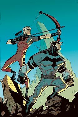
I met Tim Kane, the artist on this book, today. He's a very cool guy. He gave me a Batman sketch and he signed my copy of the comic. So, it's a good thing I like this title. I'd hate to post a bad review after I hit it off with the artist.

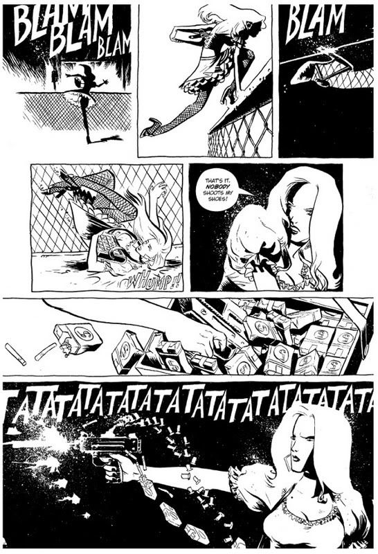
Kane's work is reminiscent of Bruce Timm by way of Stuart Immonen. He can really put a page together and his figures have a great sense of motion. Most importantly, he can draw an action scene which, in a comic called Super-Crazy TNT Blast!, is essential.

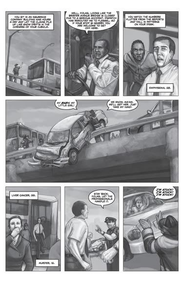
Here's a sample page (it's half of a two-page splash but it gets the point across):

You demon bastards; you killed my son

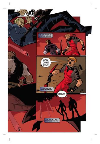
The writing by George Singley and Jim Mitchel is also good. The story: A badass demigod from another dimension has come to Earth to feed on super-powered beings. The more supers he eats the more powerful he gets. The only people left who have a chance to stop him are the non-powered types. So, an alliance of people along the lines of Batman, Captain America, Shang Chi and Dr. Strange are on the run from The Magnate and his demon hordes.

I'm looking forward to the next issue. Speakeasy has put some good stuff out lately. The Gatesville Company, for example. They're putting some great creative teams together over there and I'm definitely going to watch for all of these names on future projects.

New Comics 9/28/05

Here are some brief thoughts on some comics many, many other people have reviewed elsewhere in greater detail:

Ultimate Secret #3 (of 4) - Marvel (2005)
Play That Funky Music, White Kree

Warren Ellis looks to be having a hell of a good time writing this. It's fun and full of badasses saying and doing badass things. It's got smart people kicking ass and weird-looking aliens. Way cool! Buy the trade!

Speaking of "weird looking", I'm going to have to find a new word to convey my thoughts on most of Tom Raney's art in this issue. I'm thinking I'll use "Muh-Heinous!". This issue was super-late so I'm assuming that means that Raney was asked to do some really fast, last-minute work but, damn, some of those faces look like they're being reflected in funhouse mirrors. Also, every time the Thing shows up he looks unspeakably goofy.

The freaky art didn't detract from the fun story, though.

Jack Cross #2 - DC (2005)
I have guns!!!!

The art is much better in this issue than it was in the first one but there is a MAJOR continuity error involving a van door and the action scenes still don't have a sense of motion. The story continues and the title character shows himself to be even more fucked up than Desolation Jones.

Young Avengers #7 - Marvel (2005)
Does this cover make me look fat?

This is still my favorite monthly comic. Everything I said back in July is even more true now. The "we're superheroes but we can't tell our parents" schtick could get old real quick but Allan Heinberg makes it work. He has managed to surprise me several times during this run and this issue is no exception. I miss Jim Cheung's spectacular art but Andrea DiVito is doing a fine job.

9/27/05

Top Ten: Beyond The Farthest Precinct #2 (of 5) - Wildstorm (2005)

Insert witty pop culture reference here

The first issue of this miniseries got off to a good start but #2 isn't keeping up the pace.

First off, the jokes are even broader and more on-the-nose than the ones from issue #1. Gene Ha and Alan Moore filled the pages of the original series with little comics-related sight gags and funny references. For example, during a scene involving a traffic accident, a vehicle zips by containing a bunch of Mr. Fantastic types who are all stretching their necks out of the windows. Get it? Rubberneckers!! Paul Di Filippo, on the other hand, gives us a company called "Rexcorp" led by a Scooby-Doo lookalike named "Rex Ruthor"

Sigh.

The humor's not all that bad, by any means, but added to the heavy-handed commentary on post 9/11 security measures it makes for a much harder read than the original.

The story Di Filippo has cooked up so far is good on its own. We don't need to be hit over the head with things from the real world. In fact, there's a mention of an event "in New York four years ago". I hope that's not a direct 9/11 reference because that's exactly the kind of thing that will knock me right out of a story. Neopolis is not the kind of place that could possibly exist in the same world as our New York. We'll see what happens but this issue has failed to realize the potential promised by the first one.

Jerry Ordway's art continues to be excellent.

The merits still outweigh the flaws. Really, something egregious will have to happen to make me not buy the next three issues. I had fun reading it, just not as much fun as I thought I would.

9/26/05

Green Lantern Corps: Recharge #1 (of 5) - DC (2005)

Hey!  My ring's shiny, too!

I thought I was a big Green Lantern fan for a while, there. Turns out I'm a big Green Lantern Corps fan. I mentioned a lot of the stuff I like about the Corps in an earlier post and the first issue of Green Lantern Corps: Recharge has quite a lot of it.

The GLC has a long history in the DC Universe and many writers over the decades have had a lot of fun telling its stories. Geoff Johns and Dave Gibbons have written a great opener to this miniseries. Hal Jordan and John Stewart are staying put in Sector 2814 (Earth's sector) while Kyle Rayner and Guy Gardner go to Oa to attend the reformation of the Corps.

There are some good scenes of various people across the galaxy being visited by rings and told to report to duty. I love that stuff. Everyone from surgeons to criminals to beggars is eligible for membership as long as they meet a single criterion: the ability to overcome great fear.

The three Green Lanterns on the cover (see above) are going to get some major screen time during this series and that's a good thing. Kilowog, Rayner and Guy all have different approaches and personalities which will give us some entertaining stories. We've been introduced to a few other new Lanterns (such as Soranik Natu of Korugar) who will be very interesting to watch.

The only complaint I have about this first issue is the art. The backgrounds and setting pieces are well done as are the aliens. However the humans (and human-shaped aliens such as Superman) are distorted and look quite non-human. It wasn't enough to distract me from the great writing but it really stood out the second time I read this issue. I don't know whether to blame Patrick Gleason's pencils, Christian Alamy & Prentis Rollins's inking or an unholy alliance between them all but I hope a new artistic team comes on board for the upcoming monthly Corps title.

The phrase "monthly Corps title" makes me happier than anything from the Big Two has done in a very long time.

9/25/05

Got the time?

Dial B for Blog throws the spotlight on one of my favorite old-school superheroes, Hourman!

9/22/05

More to come

I was late picking up my comics this week but I'll get them over the weekend. Reviews will resume soon.

I picked up a bunch of back issues at Dragon*Con and I'm planning to go all Dave's Long Box on you and review a bunch of those. First some brief impressions:

I liked Sleeper a lot more than I thought I would. I like Ruule a lot less than I expected to. The biggest surprise to me was how much fun I had reading Marvel Mangaverse. It's definitely one of those "turn off your brain" stories but I loved the take on Dr. Strange:

Don't make me go all Agamoto on your ass

9/21/05

He had the nerve; he had the blood

Chris from DC Conspiracy has posted an excellent sequential version of The Tennessee Stud

9/19/05

We don't need no stinking variant covers!

Mike Sterling explains why you should buy as many back issues of Deathmate as you can.

Right now!

Stronghold #1 (of 3) - Devil's Due (2005)

You will believe a man can fall

The art convinced me to buy this book. This is the kind of stuff I like to see in a black-and-white comic. Tyler Walpole's panels lie somewhere between photorealistic and fantastic. It's a great style for the story as well as being just a great style on its own. Plus, the dude's name is "Tyler Walpole". Great name! If he didn't exist we would have had to invent him.

The example below shows off the art nicely but Walpole really shines when he draws the members of the secret, global conspiracy of the comic's title.

And you thought you were having a bad day

The Stronghold exists to keep one guy in the dark about his true potential and they've done a great job of it until now. Michael Grey (the aforementioned guy) moves through his life in a haze surrounded by people and things with which he feels no connection. He senses that there's something more but it is so distant that he doubts the reality of the world around him.

He's like an artist with a day job.

There's another global conspiracy led by this wicked-looking guy who moonlights as a heavy-metal album cover model. The counter conspiracy is trying to get Michael to realize his potential in order to start a big war.

Hijinks ensue.

The retail price is five bucks but, as the cover states, it's 48 pages long. They shoved all the ads to the back of the book which is a trend I like. Some recent comics I've read have had their narrative flow ruined by the ads all over them.

Phil Hester has written a compelling tale with very few loose ends and some tantalizing hints of Michael's backstory. The characters are engaging and the cool action scenes are cool and actiony. If "chosen one" stories are not your bag you may want to seek alternative entertainment but I like this kind of thing. It appeals to that suspicion many of us have had since we were kids that aliens planted us here and that our "real parents" will be by to get us soon so we can use our cool powers. This one's going in the hold box.

Letting the other blogs do the work

Marc from I Am NOT the Beastmaster has more good well-written stuff to say about the latest Seven Soldiers installment.

Trust him, he's a doctor

From the excellent Polite Dissent comes the Comic Book Drug Reference which is just about the coolest thing ever.

An excerpt:

Medusagen

A hormone designed to suppress powerful immune systems. The Black Widow Stefanya took Medusagen so that she could get pregnant.
type: hormone, immune supressant.
form: pill
comic: Black Widow mini-series (2004)

9/17/05

The Winter Men #2 (of 8) - Wildstorm (2005)


There is mention of super powers and armored warriors in The Winter Men but the core of this tale of former Soviet cops and the Russian-American mafia (and how there's not much difference between the two) could just as easily take place in our own Brooklyn.

There's a great deal of violence, double-crossing and cynical Russian humor throughout this well-crafted story. Kris Kalenov is a tattooed, beat-to-hell guy who has been sent to America to find a kidnapped girl. There's a huge conspiracy surrounding her disappearance and issue #2 just peels back the smallest corner of it. None of the characters knows what to expect around the next corner and neither do the readers. I was surprised twice during this issue.

This is an exciting story with many layers. The art by John Paul Leon along with the colors by Dave Stewart look like they formed spontaneously from Brett Lewis's script. The characters are not drawn in great detail but each is recognizable. This adds to the "trust no one" feel of the world Kalenov moves through.

It's nice to see a smart, ruthless progagonist going up against equally smart, ruthless adversaries. Kalenov is in way over his head and I can't wait to see what the next issues bring. This will make a beautiful trade but I can't wait that long.

9/15/05

This is a test of the emergency moblogging system. I'm on my way to the flcs to get 5 fists of science.

--

Mobile Email from a Cingular Wireless Customer http://www.cingular.com

9/14/05

Death Jr.#3 (of 3) - Image (2005)

As seen on TV!

Yeah, it's based on a video game but don't hold that against it.

Gary Whitta wraps up the story with the requisite amount of drama and action and Ted Naifeh draws the hell out of it. I can't easily describe the style other than to say it is cute and creepy at the same time. Naifeh's really good at that kind of stuff.

The cover (see above) was done by Steve Purcell who put his own stamp on the work while maintaining the look Naifeh established for the interiors (along with, I suppose, the look of the game). Click on the non-cover images on this page for examples of Naifeh's work.

The story features Death Jr. who is, in fact, Death's son. They live in the suburbs, "DJ" goes to school, his mom does the June Cleaver thing and Dad goes to work. Jr. doesn't realize that his dad does anything unusual nor does he pay much attention to the fact that he ends up hanging out with the outcasts and freaks at school.

A field trip to the museum goes bad in issue #1 when DJ's friend Pandora opens something she shouldn't. The world is in peril. Hijinks ensue.

It's a really endearing story with some cool moments and more than a few touching ones. It is also, as you might guess, very funny. The art and the way the story is told make it good for younger readers as well as for "grownups" who will get more of the references. Speaking of younger readers, there are some scary monsters and (as the title suggests) many mentions of "little-d" death alongside "big-D" Death so take that under advisement. It's all light-hearted and fun, though. No more frightening than The Addams Family TV show.

Each issue will cost you $4.99 but the covers are made of cardstock, the pages are high-quality & glossy and there are no ads. Well worth the price, says I.

9/13/05

The Stardust Kid #2 (of 4) - Image/Desperado (2005)

Hey, kids! It's my 100th post!

Of course, that's less than a tenth of what some folks have but I've only been doing this since May.

Now, to the review:

Trees are bad, M'Kay?

When I reviewed the first issue of this miniseries I mentioned that there was too much telling and not enough showing. This issue does not suffer from that malady but it does make the first issue irrelevant. J. M. Dematteis is an excellent writer and the story in The Stardust Kid is a good one but he started it too early. My wife had not read issue #1 but had absolutely no trouble getting into the story. In fact, I discovered that it reads better if you start with #2. Perhaps you could pick up #1 later and consider it a prequel or something akin to the Secret Files of The Stardust Kid. The pictures are really pretty.

Which brings us to the excellent work of Mike Ploog. The comic has an excellent mix of cartoony and dark elements just as the story does. The threes of you who read Noetic Concordance regularly have probably noticed that I'm big on the art fitting the story. This does so in the best way possible.

The story involves a 12 year-old named Cody who has a not-so-imaginary friend named Paul. Paul is an ancient Faerie creature. There's all sorts of metaphor and subtext about how Cody is getting older and is about to forget childish things but I prefer to read it at face value. The conflict is provided by an even-more-ancient Faerie creature who is pissed off that all these humans have shown up and started screwing up the place. She starts turning everything into plant life.

Cody, his sister and two of their friends have to put everything back like it should be and Paul is indisposed. The story is interesting even if the narrative conceit is a bit annoying in a couple of spots. I think this would be a good title for younger readers but I'm really bad at guessing age ranges for that sort of thing. I can say that there's very little violence in the book and none of it is graphic in any way. The language is clean and the art is accessible. It's worth a flipthrough to see if you think a kid you know would enjoy it.

I don't know what Image's trade-paperback policy is but if it comes out in that form some time down the road I'd recommend getting it. However, if you run across the second issue and can't find the first you'll still be good to go.

9/10/05

Manhattan Guardian #4 & Shining Knight #4

The Infinite Crisis event isn't my cup of superheroes but I really like what Grant Morrison is doing with the Seven Soldiers of Victory megaminiseries. This is the best stuff DC (or any other comics company) has put out in years. Two of the minis wrapped up this week.

Short version: They're both awesome!!

Now for the long versions. With pictures!

The Manhattan Guardian #4 (0f 4) - DC (2005)
Where's Bat Boy?

The Newsboy Army features heavily in this one. Morrison has an affinity for quirky, superpowered kid gangs. The Deviants from Klarion #3 are another example. There's just something about adolescent ass kickers that works. The lineup features Ali Ka-Zoom, the future Merlin of the Ghetto (nice tie-in to Zatanna, there), a millionaire dog and a hyperintelligent baby. This is the kind of craziness that really sells a book to me and Morrison makes it work.

He has created a main character I really care about. Jake Jordan is a truly good man who is just trying to do the right thing with what he's been given. The publisher of The Manhattan Guardian gives him quite a bit by making Jake the newspaper's own superhero reporter. Jake, along with the other six Soldiers of Victory, ends up facing down an invasion by the Sheeda which will be wrapped up in the bookend special issue once all of the miniseries are finished.

This is by far the strongest issue of the miniseries and it answers several of the questions asked by the first three. It also ends in a cliffhanger of the highest order. I can't wait to see what happens.

Cameron Stewart's art has been consistently good throughout the series but he really shines on the flashback sections depicting the Newsboy Army's adventures. Moose Baumann fades the colors in those sections, giving them an older feel as well as setting them apart from the present-day stuff.

A lesser writer might have overplayed the camp value of the kid gang but Morrison acheives a balance between the candy-colored innocence of the past and the harsh realities of the present.

Shining Knight #4 (0f 4) - DC (2005)
Hey, Kids!  Alt Text!

Simone Bianchi's art in this miniseries is among the best things I have ever seen in a comic book. Dave Stewart, the colorist, is to be commended, as well. Every panel of these four issues has been a pleasure to behold. The first two-page splash is so evocative it would make me want to write a comic book based on it if Morrison hadn't already done so.

Morrison's writing lives up to Bianchi's images. Pacing is one of the most important talents a writer of monthly comics can possess and Morrison is its master. The story of Sir Justin has fallen into place just slowly enough to make the reader want to see the next issue. This built up to a surprise in this final issue that I honestly did not see coming. Nice work, Grant!

Justin, the last member of Arthur's round table, has been transported to our world by magical means and must fight the evil queen who wants to take over our time/space coordinates and add them to her empire. That's her on the cover, up there. The action is well-drawn and well-written and I love it when someone nails a high-stakes "fish out of water" story.

However, the best thing to come out of this miniseries is the character of Don Vincenzo. I want this guy to show up in more series after this. He's a mafia don who is surrounded by mystical enforcers and an otherworldly consigliere. He's like John Constantie as a made man. I want Vincenzo to go over to the Infinite Crisis crossovers and whack a few people. They seem to like that sort of thing over there.


These two issues encapsulate what I like about the Seven Soldiers stories. They pull together the weirdest shit from all possible sources and arrange them into fully-realized characters who are involved in stories that work on multiple levels. This is an ambitious project which has rekindled my excitement about what is possible in the comic-book medium. I hope some of the copycats inspired by it are truly inspired.

9/9/05

Smoke and Guns (OGN) - AiT/Planet Lar (2005)


High Concept, thy name is Smoke and Guns.

If this book were a movie its director would call Robert Rodriguez and Guy Ritchie sissies. If it were a car it would be a '68 Mustang with a flame job and a rocket launcher. If it were a radio station it would only play Big Band tunes remixed by The Prodigy and they'd have contests where you win moonshine and baseball bats with nails in them.

Smoke and Guns is all about the attitude and so is Scarlett, the main character. She's a member of the Grand Avenue Puffs, a cigarette-girl gang. Scarlett isn't content to stick to her own district so she moves about town stirring up trouble. Good thing her trigger finger is as quick as her tongue.

Kirsten Baldock (a former cigarette girl, herself) makes an excellent debut with this violent, edgy tale of a city where your life can be snuffed out as easily as the match that lights your smoke. Fabio Moon provides exactly the look this book needs. The art is sexy, funny and the kind of stylized that just clicks with an all-action story like this. Here's a good example of both the art and the action. If that doesn't intrigue you maybe "S 'n' G" (as all the cool kids will soon call it) isn't your cup of nicotine.

With lines like "(A) guy can't even look at a dame like you without losing money", the writing is smart and self-aware with nods to everything from Dashiell Hammett to Coyote Ugly to A Better Tomorrow. It's a fast-paced, self-contained story and there's not a dull moment in any of the 104 pages. If you're looking for introspective storytelling or a meditation on the human condition, seek elsewhere, bucko! Smoke and Guns is a kickass, bullet-slinging juggernaut of a story. Fork over your dough, light one up1 and hang on.

1The staff and management of Noetic Concordance do not condone the use of tobacco products or accessories nor do they advocate the use of firearms as negotiation tools

9/7/05

Back From Dragon*Con

That'll be six bucks an hour, ma'am.

We're back from our vacation at Dragon*Con and we had so much fun (and so little sleep) that I never found time to update the blog. I'll provide more details later but the comics-related highlight of the con was attending a panel by Ted Naifeh and Eric Powell. I love both of their stuff and they had great things to say about comics in general and about the darker side of comics specifically.

I also chatted with Brian Stelfreeze of Gaijin Studios briefly. He's a great guy and a very good artist (see my earlier comments on Matador for an example of my feelings on Mr. Stelfreeze's work. I told him how much I like his art and he remembered doing a portfolio review for my wife two years ago. He asked me to pass on his compliments to her. Cool!

I also bought a bunch of $1 and 50¢ comics along with a couple of trades and way, way, WAY too many roleplaying supplements. I picked up a lot of indy titles I hadn't seen before and I'll review those along with the new Marvel/DC stuff I've grabbed lately.

Now for sleep...