8/30/05

Is There a Doctor in the House of Ideas (repost)

The Noetic Concordance staff is taking a much-needed vacation to Dragon*Con beginning tomorrow. I'll do my best to file some con reports but we're going to be in the Land With No Wireless Access for a couple of days. For now, we bring you this special, deluxe, encore presentation!

In the Marvel Universe every hero or villain with the title "Doctor" has an actual PhD. These guys had to do dissertations. Do you think Spiderman was ever subject to peer review? No, he just got bitten by a spider, slapped on a costume and then paraded around NYC like he owned the place. Sure, Luke Cage graduated from the School of Hard Knocks but he never had to teach a freshman chemistry class.

Here are just a few of the people who got their advanced degrees the Mighty Marvel way!

Dr. Octopus: Nuclear Physics
Dr. Druid: Psychiatry
Dr. Strange: Medicine (neurosurgeon)
Dr. Sun: Biology/Computer Science
Dr. Spectrum: Astronaut. The university which granted Joe Ledger's doctorate is in an alternate dimension. Don't get me started on the red tape involved in getting a copy of a transcript from Earth-S. Let's say physics for now.
Doc Samson: Psychiatry
Doctor Demonicus: Genetics

And the big daddy of them all:
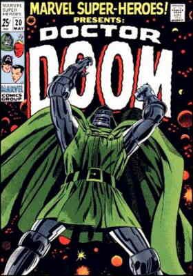
Doom Demands Cheetos!

My favorite Victor Von Doom factoid is that he was Reed Richards' roommate.

That must have been a non-stop party.

"Doom commands you to be absent from the room this evening, Richards."

"What? Have you got a hot date?"

"That is none of your concern. Your inferior intellect could not possibly conceive of the--"

"Save the histrionics, Victor. I've gotta study and all my books are here."

"Curse you, Richards. You will rue the day you crossed Doom."

"Blah, blah, blah, you said the same thing when I drank the last of your weird, imported beer."

"Latveria has the best beer in the world and that stuff is expensive to ship!


So, Doom gets horribly disfigured and blames his roommate. Forever.

Richards gets back at him by being more humble than Doom. "Oh, no, 'Dr. Fantastic' seems so haughty. Just call me Mister Fantastic."

OK, so being more humble than Doom isn't that hard but Reed could have gone with the "Doctor" monicker. I suppose he went for the more marketable superhero name.

Unlike, say, Dr. Lemuel Dorcas:

Yeah, that's right.  Dorcas!


It's not really a surprise that this guy's supervillain career never took off.
8/29/05

Dragon*Con looms in the distance

I'm headed to Dragon*Con on Wednesday and I plan to pick up lots of indy comics from the fine people in the dealers' room(s). Any suggestions for stuff to look out for? There are many, many comics dealers there so back-issue recommendations are welcome as are new things.

So, help me out. This money don't spend itself!

8/28/05

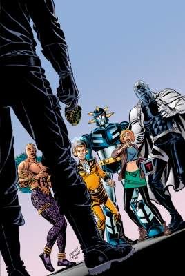
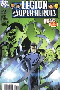
Legion of Super-Heroes #9 - DC (2005)

It's not easy being green and in the background

This issue is better than it has any right to be, following, as it does, the events of a rather bad issue. The aftermath of Brainaic 5's coup is being handled well, so far and I have no problems with any of the characterizations unlike Issue #8 where no one was adhering to their earlier, established personalities. Some of the characters do jerko-teenager stuff but that's because they're jerko-teenagers. Funny how that works.

The big story arc gets a few shoves towards its conclusion and the bad guys get a tiny bit of character development. A satisfying read. This is pleasantly surprising because I expected I'd want to drop this from my hold list after this issue. For now, it remains.

Georges Jeanty did the pencils and I don't like the way he draws faces. It's not as bad as the "everyone looks the same" work of Kevin Sharpe and Prentis Rollins from issue #8 but it's still nowhere near the bar Barry Kitson set in the first seven issues. Inks by Art Thibert (which look good) and Sno Cone did the colors.

ASIDE: Sno Cone? What the hell is up with colorists these days? (Hi-Fi design is another example. I realize that there are multiple artists working there but if Brian Miller did the colors on an issue why can't he put his name in the credits?) Back to Sno Cone: Are colorists like DJs now? Everyone's gotta have a cool handle. From now on you can call me "MC Comicraft".

Anyway...

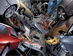
This issue is nearly worth picking up for the letter column alone. It depicts Light Lass and Star Boy sitting among huge stacks of letters and attempting to answer them. It's hilarious. It was also drawn by Barry Kitson. Putting Kitson's work opposite a page full of weird-nosed mannequin people makes me miss Barry more. I hope he's back on board soon.

8/27/05

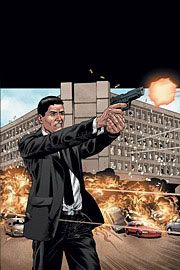
Jack Cross #1 - DC (2005)

Take that, Limbaugh!

Hooray! Another ongoing series by Warren Ellis.

Ellis has a fascination with people who do tough jobs and the effects those jobs have on them. The title character in Desolation Jones, Ellis's other current ongoing series, was physically and psychologically changed by his time as a spook. Jack Cross hasn't been chewed up and spit out by the system yet but he's feeling the weight of his past.

Cross is brought back into the intelligence community because his special skills are needed to break the anti-interrogation training of a fellow operative. The story is good and well written even if I could see a couple of the beats coming just before they happened. That premonition comes from reading a lot of Ellis's work. He often comes back to the same motifs but the variations on them have yet to be anything but entertaining.

My only complaint about this issue is the art. Gary Erskine does a good job with the static compositions but he doesn't convey the action scenes very well. This is too bad because the action in this issue is vital to the story. The interrogation scene, which is the centerpiece of the issue, doesn't come off with the impact it should. I don't know how much of this is the artist's decision and how much came from the script but I hope the two creators on this title come to a better understanding of how to get the shootin' and hittin' across.

However, all flaws were forgotten and forgiven once I read the last page. The images there told us more about who Jack Cross is than anything before. Erskine really captures the emotion and humanity of a man who has to do inhuman things for a greater cause.

8/26/05

Stop! Hammer time!

Erick Hogan of the excellent Glyphs blog has a modest proposal for DC to bring more heroes of color into their main titles.

And damned if I don't think it's a great idea.

Rampage Rampage!

I like Fanboy Rampage. It's over there in my sidebar but I want to bring it to your attention. A few days ago I mentioned a bunch of new (to me) comic blogs I like so I thought I'd plug one that I read every day.

Fanboy Rampage is mostly about other comic sites. He grabs stuff from message boards such as the Bendis & Goeff Johns boards and he grabs news releases from companies. It's a great distillation of what's going on in ComicBlogLand. Most importantly: he reads Millarworld so you don't have to!

Check him out.

A Simple Query

So, um...anyone else going to Dragon*Con?

8/24/05

Klaus "The House" Gets Down

OK, Fanboy Rampage has already linked to this interview with Klaus "The House" Janson on Comic Foundry. In fact, they even pulled the same quote I did (see below) but it directly addresses something I don't like about certain artists:

"There's a trend in comics right now that seems to work with the audience and that is a riff on being 'realistic' - using photos and such as a basis to get closer to reality. Although, personally, that just makes me absolutely vomit... I don't think that comics are about photorealism, and I tell you that if I had one wish for this medium it would be to pull back from that. I think it's the thing that's going to kill comics. Don't get me wrong, there have always been artists and comics that rely on photorealism including myself, I might add, but it's going too far. The problem is that the attempt to mimic realism in comics results in work that is very limited and constrained... Comics are not about reality, it's about reality plus."


You go, Klaus!!

I don't think that style of art will actually "kill comics" but Klaus really articulated the thing that bothers me about, say, Greg Land's art on Ultimate Fantastic Four with that last sentence. Also, it's a really good interview with one of the best inkers in the business.

Um...just to attempt to throw something remotely similar to original content into this post, check out my mention of Janson's deal with Marvel. Er, which consists of a link to a Newsarama article and a couple of cool Janson pictures. Oh, well.

8/23/05

Klarion #3 (of 4) - DC (2005)

Witchboy took the brown tab

I mentioned previously that Zatanna #3 is my favorite of the Seven Soldiers miniseries. This is still true. However, Klarion has the best art. Frazer Irving is the man! I love the look of every single panel in this comic book. The penultimate page is one of the finest pieces of visual storytelling I have ever seen.

Like Zatanna, this mini really shines with this third issue (which is good since it's only got one more after that). Grant Morrison is really good at building a story brick by brick while maintaining an interesting pace. This issue is practically self-contained though it works better when you know where Klarion has been before.

The story involves a kids gang called "The Deviants" who work for a wonderfully Satannic-looking guy named Melmoth. The kids are testing Klarion to see if he's worthy to join them while a deeper story goes on just behind the scenes.

Morrison shows his ability to write many different voices in this issue. All of the characters are well-realized and the story had me excited to see what each new panel would bring. Not half as excited as I am to see what issue 4 is gonna do.

In short: Klarion #3 is what I read comics for.

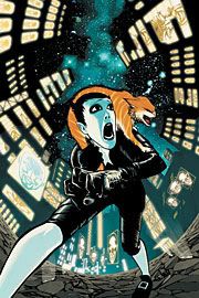
Night Mary #1 - IDW (2005)

Man, that is one creepy pig

This one surprised me. Pleasantly. However, "pleasant" isn't a term that you're going to find used in regards to this book very often.

Night Mary is dark, folks. Really dark. The title character has the ability to enter the dreams of others and she sees some messed up stuff in there. She assists her father, a psychaitrist, as he attempts to help his patients via dream therapy. Mary can communicate with the dreamers and she tries to help them sort out what their subconscious minds are saying.

The art is weird, sketchy and evocative, much like a dream. The style helps to soften the impact of some of the gruesome things it depicts. There are very few graphic scenes of violence or bloodshed but what's there combined with the parts that are left up to the imagination get the point across in spades. One thing I really like about the art is that the dream sequences are in brilliant color (like the cover, above) and the real world scenes are all monochrome. This fits Mary's life perfectly. She lives a dull existence except when she's riding the dreams of others.

There are hints of deeper, more sinister meanings to Mary's encounters which I hope will be fleshed out in later issues.

To sum up: It's a good story with great art but it is Not. For. Kids.

Story and Script: Rick Remender
Story and Art: Kieron Dwyer
.

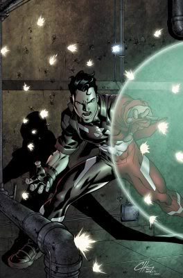
Hellions #4 (of 4) - Marvel (2005)

Stop shooting at me!

This was a fun miniseries. The title is a reference to Emma Frost's team of "anti-New Mutants" from the '80s who were somehow cool despite the fact that their powers totally mimicked those of the New Mutants.

This miniseries really has nothing to do with the original Hellions other than the fact that they are all mutants and Emma is an authority figure to them. They are students at Xavier's school and for the most part, their powers are original and cool. Hellion (he's the one on the cover above) is a powerful telekinetic. Dust can become her namesake and gets really cool cloud effects when she moves. Wither kills anything he touches; he's the Rogue of the group without all the "y'all"s. Mercury is composed of liquid metal which allows her to do T-1000 type things.

I listed all of the powers above because they are the ones that don't knock me out of the story. The remaining two members of the team have powers that seem like Nunzio DeFilippis and Christina Weir, the writers, were just trying to come up with something different for the sake of difference. Tag is not a mutant graffiti artist. Instead, he has a form of mind control which allows him to touch someone, making the target "it". Others are compelled to run from "it". And Rockslide looks like your garden variety brick à la the Thing but (get this) he can fire his fists at you! Just like a Shogun Raider.

The story carries no surprises but it is a very nice "be careful what you wish for" cautionary tale with a slight twist. I like the bad guy a lot. It's nice to read a self-conatined story in which the conflict doesn't decide the fate of the world. I'm not going to go into details about the story because there's little I could say that wouldn't give large parts of it away. Suffice it to say, it's a good story, well told. The characters are distinct and don't fall into the stereotype trap.

The art is clean and fits well with the tone of the story. Clayton Henry did the pencils which were inked by Mark Morales and Jay Leisten. Will Quintana, the colorist, deserves special mention. He really made the panels sing whether he was muting things or zapping bright reds and oranges around.

This will make an enjoyable trade and you don't need to know any of the convoluted X-Continuity to understand it.

8/21/05

Indy Sherpa

Want to buy more indy comics but got no idea what's out there? You could do a lot worse than checking out Randy Lander's Snap Judgements post where he gives his opinions of many recent first issues (i.e. good places to start!).

Top 10: Beyond the Farthest Precinct #1 - Wildstorm/DC (2005)

Oh, my god!  We're on the cover of a comic book!

Paul Di Filippo and Jerry Ordway team up to bring Neopolis's finest back into print. I don't normally give number-type ratings but the best way for me to express my opinion of this first issue is to give it an 8 out of 10. "10" in this case would mean that it had the feel and quality-level of the original Top 10 series by Alan Moore and Gene Ha.

I was completely swept away by this comic. The original miniseries is by far my favorite of the America's Best titles and this one (unlike the Smax miniseries) fits perfectly in the Top Ten universe.

For those of you not familiar with the first series: Top 10 takes place in Neopolis, a city which consists entirely of superheroes. Everyone from the homeless guy outside your building to the Mayor has superpowers. The main characters of the comic are members of the city's police force. Hilarity (and every now and then gripping drama) ensues.

Ordway (the artist) nails Gene Ha's original character designs and gives them a more traditional comic-book ink job. Every page is full of little visual nods to other comics much like the first series. It's the kind of art that requires multiple viewings to see all the stuff but it doesn't distract the reader from the story at hand.

Di Filippo (the writer) has come up with a compelling story and he drops us in head first within the first few pages. There's just enough time for us to see what the cops have been up to the past five years before WHAMO! the plot lands on them like a ton of bricks. Not that a ton of bricks would hurt most of these officers.

The only complaint I have about this issue is the dialogue. For the most part it flows well but there are some moments where Di Filippo sacrifices conversational rhythm in order to make a funny reference. Phrases such as, "Scyphoza the monster Coelenterate" don't really roll off the tongue. A few of the other references are either too blatant (Namor, a "Hero or Menace" flyer with Spider-Man's face on it) or too obscure (Neptune Perkins) but there are so many of them that a couple of speedbumps can be excused. Here's a page with annotations for some of the references.

My favorite thing about comics is that sense of "I can't wait to see the next issue" I get from the really good ones. I've got that in spades with this.

8/20/05

Blog-a-log-along with us

Tegan of Bloggity-Blog-Blog-Blog fame wishes I'd update more often. I do, too. So, I'm using her Blogaround Challenge as an excuse to do just that. And check out her blog. It is teh rock.

1. I like The Comic Asylum a lot. He's just wrapped up his "10 Greatest Comic Battles Ever" series. Good stuff. It helps that I agree with him about said battles.

2. Tom Foss of the Fortress of Soliloquy (excellent name) likes Suicide Squad and still sports his "Brains Over Brawn" banner. These are good things. Mr. Foss is a mensch.

3. The Counter-Culture is a good mix of previews and comments on the comics industry.

4. Devon Sanders inhabits Seven Hells! which is another awesome name. Even more awsomer is his post about Black Manta.

5. Jason Rodriguez, an editor from Hoarse & Buggy Productions has his own blog with lots of "what it's like to be a comic-book editor" stuff in it. He's a good, engaging writer.

6. Comic Book Wife has the following tagline: "Just an ordinary comic book wife and her comic book life. Follow me through the trials of playing house with my artist hubbie." It's a good, frequently-updated blog with great content and it has a wedding picture where the dude's dressed like Thor! Thor, man! That's hardcore! He's got the hammer and everything.

7. Comics Ate My Brain has good, short reviews of the latest Wednesday offerings and it brings the funny with some longer pieces.

8. The original comics at Freak Comics such as The Adventures of Stickman are funny. You can also find some reviews and commentary on (mostly Marvel) comics. Me like.

9. Comic strips are totally The Comics Curmudgeon's bag, baby! Yeah. He's got a sense of humor and he's not afraid to use it! He'll show you. He'll show you all!!

10. Brandon Hanvey speaks the mighty name of The Geekout Blog and becomes wreathed in psychic flame which allows him to post really cool previews of stuff he's working on.

Anybody else want to try this? I found a bunch of very cool blogs. Thanks, Tegan!

8/19/05

MaGuire is teh RoXXorZ

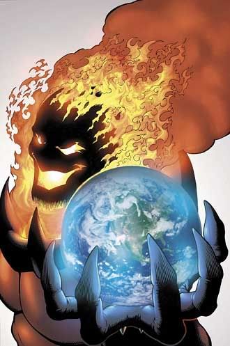
A while back I mentioned that Kevin Maguire should be the only person allowed to draw Dormammu, ever.

Here's why:

Hey, kids!  My Head's on fire!

P.S. Defenders #1 by Giffen, DeMatteis & MaGuire has sold out.

8/17/05

Ultimate Fantastic Four #22

I thought UFF #22 was "just OK" but this image of what happens when Magneto gets down to business is one of the coolest things I've ever seen in a comic.

The link above isn't working for some people so I've got a smaller version of the picture below:

Image hosted by Photobucket.com

8/13/05

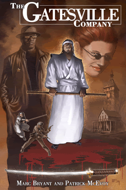
The Gatesville Company #1 - Speakeasy (2005)

Swords and Little Sunglasses

Well, I talked the talk a while back and in my continuing attempt to walk the walk, I want to tell you about The Gatesville Company.

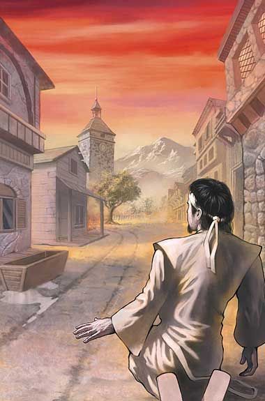
Mark Bryant (writing) and Patrick McEvoy (painting) team up to bring a kickass story into the world. Kazuo Kojima, master swordsmith, commits seppuku and immediately ends up in Gatesville. Check out page 2:

I don't think we're in  Kyoto anymore

Now, that's an opening!

The story is simple and well-told. Kazuo-san's got to get his sword back from this asshole or he's trapped in Gatesville forever. Gatesville is a sort of halfway house for the afterlife. The art is superb and fits the story well. Some painted comics consist of many beautifully-crafted panels filled with emotionless mannequins. McEvoy is able to paint emotion and expression and life into these panels. See for yourself.

The best thing about this issue is that it's completely self-contained. If you aren't able to find this issue (and I strongly encourage you to buy it if you do) you can pick up #2 whenever it comes out and you won't be left behind. Each issue will be its own story while still being tied to the same place. I'm assuming that the very cool Mr. Cross and Ms. Brand will appear in all the issues kind of like a sepulchral Tattoo and Mr. Roarke.

This story felt like a really good episode of The Twilight Zone. Man, I'm glad I picked this up.

8/11/05

Zatanna #3(of 4) - DC (2005)

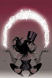
Black Magic Woman!

Blah, blah, Grant Morrison is an amazingly good writer blah, blah we're not worthy blah a god who walks among men, etc. etc.

Now that that's out of the way:

Zatanna is the miniseries of all the Seven Soldiers minis that I have enjoyed the most so far and that's saying something!

#3 is the issue that brings Zatanna and her charge, Misty, fully into the stories of the other minis. Especially Shining Knight which is my second favorite. This issue builds upon the two before it and really brings everything together.

Morrison does some wonderful things, here. He manages to combine great action with powerful emotion. I love the feel of the magical world Zatanna and Misty travel through. Little touches like the blue-flame-wreathed skeleton who drives spirits to their final resting places in his bus really grab me. Zatanna takes many things in this world for granted that would freak most people completely out (e.g. exorcisims). Therefore, when something makes her freak out we know it's big.

Ryan Sook's pencils and Mick Gray's inks are superb. I don't possess the proper visual-arts vocabulary to express how well their work fits with Morrison's writing. They bring Magical Los Angeles to life and Nathan Eyring's colors make it sing. Zatanna looks competent, beautiful and a little sad. This issue is worth opening up just for the artists' portrayal of Ali Ka-Zoom, the Merlin of the Ghetto.

You can enjoy this miniseries without having read the others. You don't even have to be familiar with the DC universe's "continuity". I'm assuming these will show up as a trade at some point but, if not, hunting down the back issues of this would be worth it.

8/10/05

From the "Wish I'd Thought of It" Files

If you've ever read one of Warren Ellis's Bad Signal newsletters it is imperative that you check out Steve "gutterninja" Pheley's BAT SIGNAL

8/9/05

Ultimate Spider-Man #81 - Marvel (2005)

You dirty rat!

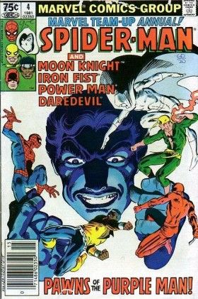
Once there was a Marvel Team-Up Annual which featured the following superheroes:

Spider-Man (natch)
Iron Fist
Power Man
Daredevil
Moon Knight

I thought it was the coolest thing ever. It was bigger than a regular issue and the bad guy was the Purple Man who had the power to make people do anything he told them to do. He had Xtreme hypnotic voice powers which he got through exposure to a mysterious gas. In the Marvel Universe, radiation and chemical weapons are good things. They give you kewl powerz.

Here's the cover:

Man, that guy has a big face!

It was, in fact, the coolest thing ever. If they'd managed to work Cloak & Dagger into the story it would have become a coolness singularity and collapsed in on itself.

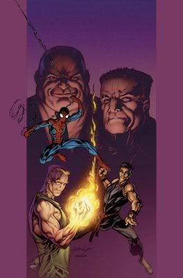
Anyway, the current storyline (Warriors) from Ultimate Spider-Man reminds me of that Annual. Here's the team-up:

Spider-Man
Iron Fist
Shang-Chi, Master of Kung Fu
Moon Knight (badass!)

Be sure to throw the word "Ultimate" in front of each of those. Wouldn't want anyone getting confused.

This lineup has the potential for supreme coolness. Any one of these guest stars would be worthy of his own entry in The Badass Files and this third part of the story delivers the Big HK Action Fight you'd expect. However, there's something missing. Bendis hasn't made these characters stand out, yet. Iron Fist and Shang-Chi are going through the motions of Martial-Arts Plot #19: The Gang War and Moon Knight hasn't done enough for us to know what his deal is yet.

I'm not disappointed in this issue but I wish there had been a little more meat to it. There is an excellent scene between Spider-Man and Ultimate Jean DeWolfe and the fight scene is exciting and fun. Bagley's art is, as always, superb especially during the scene where Iron Fist and Shang-Chi catch up over dinner.

There are four more parts to this story which means that #82 is likely to slow the action down a bit to allow for some much-needed exposition. Also, the last page of this issue should lead into a very interesting opener to the next one.

This is one of those stories that'll work better in the trade which (even though this is no Marvel Team-Up Annual #4) I can recommend that you buy when it comes out...about five minutes after the ink dries on issue #85.

8/7/05

Kickin' it on the Indy tip, yo

Greg from Comics Should Be Good discusses three graphic novels from independent companies that I want to check out:

The Annotated Mantooth (AiT/Planet Lar)

Heartbreakers Meet Boilerplate (IDW)

and the one which intrigues me most, Capote in Kansas (Oni Press)

The Imaginaries #3 - Image (2005)

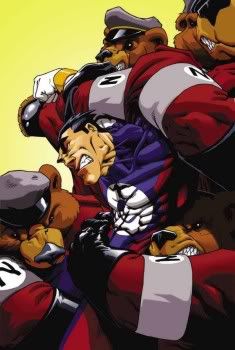
Why did it have to be bears?

Anything containing the line "I heard the call of Liberty's siblings, Equity and Equality, and answered that call with extreme prejudice!" scores extra points with me.

This is the pentultimate issue of the Lost and Found storyline and it's the one where things really pick up steam. The first two issues did a good job of setting up the Imagined Nation which is where imaginary friends go when the children who dreamed them up no longer want them. The realm is ruled by the Ice Queen and she hasn't made it a nice place. Her draconian rules are enforced by her army of sadistic, jackbooted teddy bears.

For the record, anything which elicits the phrase, "sadistic, jackbooted teddy bears" also scores extra points.

Enter Superhero G who is not willing to accept that his sidekick, Tanner, no longer has any use for him. He also doesn't like the way the Ice Queen runs things. In D&D terms, G is Neutral Good while the Queen is Lawful Evil. G gets a job as a reporter and only appears in his true identity when there's injustice that needs to have its head knocked in. Hijinks ensue.

The secondary characters, such as Melee Mouse, are superbly done and Greg Titus's art fits Mike Miller & Ben Avery's story perfectly. The showdown with the Queen (if it happens in #4) should be good. Image has already put an ad for the first trade in the back of this issue so, if you haven't been buying the individual issues, wait a little while and fork over the ten bucks. You'll be glad you did.

8/6/05

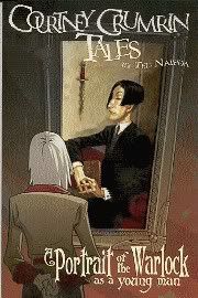
Courtney Crumrin Tales - Oni Press (2005)

Anything is possible...with magic!

I was going to write a review of A Portrait of the Warlock as a Young Man by Ted Naifeh but Randy Lander from The Fourth Rail beat me to it and said all the stuff I was going to. Plus a bunch more.

Er, I thought it was good. Go buy it.

Nextwave

This article from Comicon.com's The Pulse has a lot of new information about Warren Ellis's ongoing title for Marvel, Nextwave.

I love Immonen's art on this. It'll be in my holdbox for sure.

8/5/05

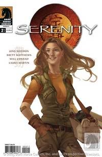
Serenity #2 - Dark Horse (2005)

Big Damn Hero!

I'm not one of those people who thinks Firefly was the best show in the world. I'm one of those people who thinks it was the best show in the universe! Ever!

Being such a drooling fanboy about the show, I had mixed feelings when I heard that a comic miniseries was on the way. My first thought was, "Sweet! A Firefly comic!" This was quickly followed by, "Oh, jeez! I hope it doesn't suck."

Good news! It doesn't suck. The dialogue and story really capture the feel of the show. The art is hit or miss but it's not easy to consistently draw images of actual actors and it's not like I ever got, say, Jayne and Inara mixed up.

This second issue was a little jumpy in places. For example, I'd like to have seen more build up before Book decks Mal. The way it happened in the comic made it seem out of character. If it had happened on the show we would have seen it move more organically. This may just be a matter of pacing. A different arrangement of panels would have solved that problem.

Overall, I am really enjoying this. The few flaws such as the aforementioned pacing and the Chinese being written in actual Chinese (although phonetic spellings would be equally distracting) are overshadowed by the quality of this miniseries.

One smart thing Dark Horse did was to hire three cover artists per issue. I normally despise the variant cover thing but these are so well-done that I want to collect them all. I only bought one version of the first issue (Mal by John Cassaday) and I currently only have the Kaylee cover by Jo Chen (see above) but if I can get my hands on a copy of the Tim Bradstreet Book cover (see below) it will be mine.

I don't give a hump if you're innocent

8/4/05

Two more miniseries I'm giving up on.

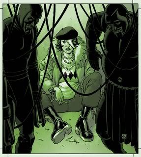
Albion #2 - Wildstorm (2005)

It's not easy being green

The first issue of Albion showed promise. I liked the art a lot and I was intrigued by the two main characters. However, the big reveal at the end of the issue left me flat. I got the idea I was supposed to know who the figures were. OK, I recognized the Cyberman but the other two?

Albion #2 knocked down the good will that #1 had built up. The interactions between the two main characters became shrill and the number of references to things I didn't recognize increased dramatically. Also, the frequent cuts to the "Prison of fucked-up wankers" were frustrating. The worst thing about the second issue was the obtuseness of the storytelling. Grant Morrison's stuff is wacked-out and nonsensical but it holds together. Leah Moore and John Rippion are going in so many directions with this that I can't follow whatever threads may be there.

Maybe there'll be an annotated trade.

The covers by Dave Gibbons (see above) are very nice and George Freeman is a spectacular inker but they aren't enough to keep me coming back.


1602 New World - Marvel (2005)

Rarrrgh!  I am a dinosaur!

I thought 1602, the first miniseries by Neil Gaiman was just OK.

This sequel makes its predecessor look like Death: The High Cost of Living. New World is a jumbled mess that made me stop caring about characters that Gaiman started off as sympathetic.

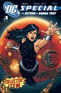
The Jiminez interview mentioned in my previous post helped explain the uneven quality of the Donna Troy miniseries. In a similar vein, I have run across a transcript of the meeting between Greg Pak, the writer and Greg Tocchini, the artist, where they came up with the first issue:

Pak: So, the Hulk's in the New World and there are dinosaurs. He's gonna fight 'em!

Tocchini: Right. Dinosaurs.

Pak: I mean a lot of dinosaurs.

Tocchini: Sure, man, I can do that.

Pak: I don't think you follow me. You're not grasping the magnitude of the dinosaurage we're gonna have in this issue. It's gonna be a fuckin' Where's Waldo of dinosaurs. I want herds of 'em in each panel.

Tocchini: Each panel? Even the ones where people are indoors.

Pak: Yes.

Tocchini: Well, all right. You're the writer.

Pak: I like dinosaurs!

Seriously, there are pages and pages of big lizards followed by more pages of lizards. I like dinosaurs but a man can only take so much.

There are a couple of neat moments in this book but not enough to offset the lack of pacing and interesting story. I'm not even going to check out the trade on this one.

Wonder why I'm not buying this again?

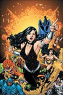
Hey, Kids!  It's Donna Troy!Wonder Girl and her Amazing Friends

I've given up on The Return of Donna Troy miniseries. This article gives Phil Jiminez a chance to explain why.

8/2/05

Wizards and Warriors

It looks like the Comic Geek Speak podcast broke the story of Wizard World pulling out of Atlanta for 2006 with this interview with Gareb Shamus.

Here's a Newsarama article about it

8/1/05

Submit!

Comics creators often say, "There are no comics critics just people who want our jobs".

Guilty as charged.

Chris Piers has some great tips for submissions to various companies.

What, am I made of stone?

This. Must. Be. Mine!

I mean, look at the cover, man!

Image hosted by Photobucket.com

This is what I read comics for: Jimmy Olson = Yo=Yo!

JLA Classified #10 - DC (2005)

Bat-tusi!

Warren Ellis wrote this story (entitled "New Maps of Hell") in 2003 and it is set in the DC Universe of that time. Lex Luthor is president and Brad Meltzer is still just writing novels. Three seemingly unrelated situations are pointing towards a common cause.

Lots of LexCorp employees have been committing suicide lately. Clark & Lois are on the scene of the latest one. Their banter is reminiscent of the Tracy/Hepburn movies. It's light on the surface but the subtext shows the depth of their relationship. Butch Guice nails these characters. Clark is clean-cut, strikingly handsome and no-nonsense. Lois is beautiful, a little wicked-looking and there is intelligence in those eyes. This is some of the artist's best work.

We get to see the journalists (mostly Lois) doing real journalist stuff. I like that a lot. The only part of the newsroom scene that didn't work for me was Perry White's dialogue. He comes off sounding too much like Spider Jerusalem and that doesn't fit with my idea of the Planet's editor-in-chief. Despite that, he gets some great lines.

The second scene begins with Batman's transformation. A lot of comics shorthand the steps of the secret-identity-to-superhero switch. We don't need to see it every time but it's nice when it shows up. Ellis knows when to turn off the dialogue and let the artist interpret the story. When you've got Guice drawing your script you're in good hands. Stately Wayne Manor looks great. Bruce looks like a driven, intensely-focussed man. Gotham and the Batcave both have the proper sense of dark spaciousness - opressive and bigger than life.

Wonder Woman is next. She's meeting some academics on Themyscira and the character design on Wonder Woman is the best of the bunch. Instead of the swimsuit, Guice has her in a looser version of her usual costume. Diana's introduction to the plot is the most dramatic. Huge explosions rock the island and that's where we leave the story.

I don't know if we're just getting the Big Three on this one or if more JLA members will show up. I'd like to see Ellis and Guice work with the Martian Manhunter or one of the Green Lanterns but if it's just the Triumvirate of Justice, that'll be fine, too.

This is a JLA story through and through. Those of us who have read a lot of Warren Ellis comics can see his fingerprints on it but, so far, it's a straight-up superhero tale and it's off to a great start.